Available 2026

Aurora Architects

A visual identity for a London architecture practice, built around a single peaked letterform.

Client

Aurora Architects, London

Year

2026

Role

Identity, stationery, guidelines

Scope

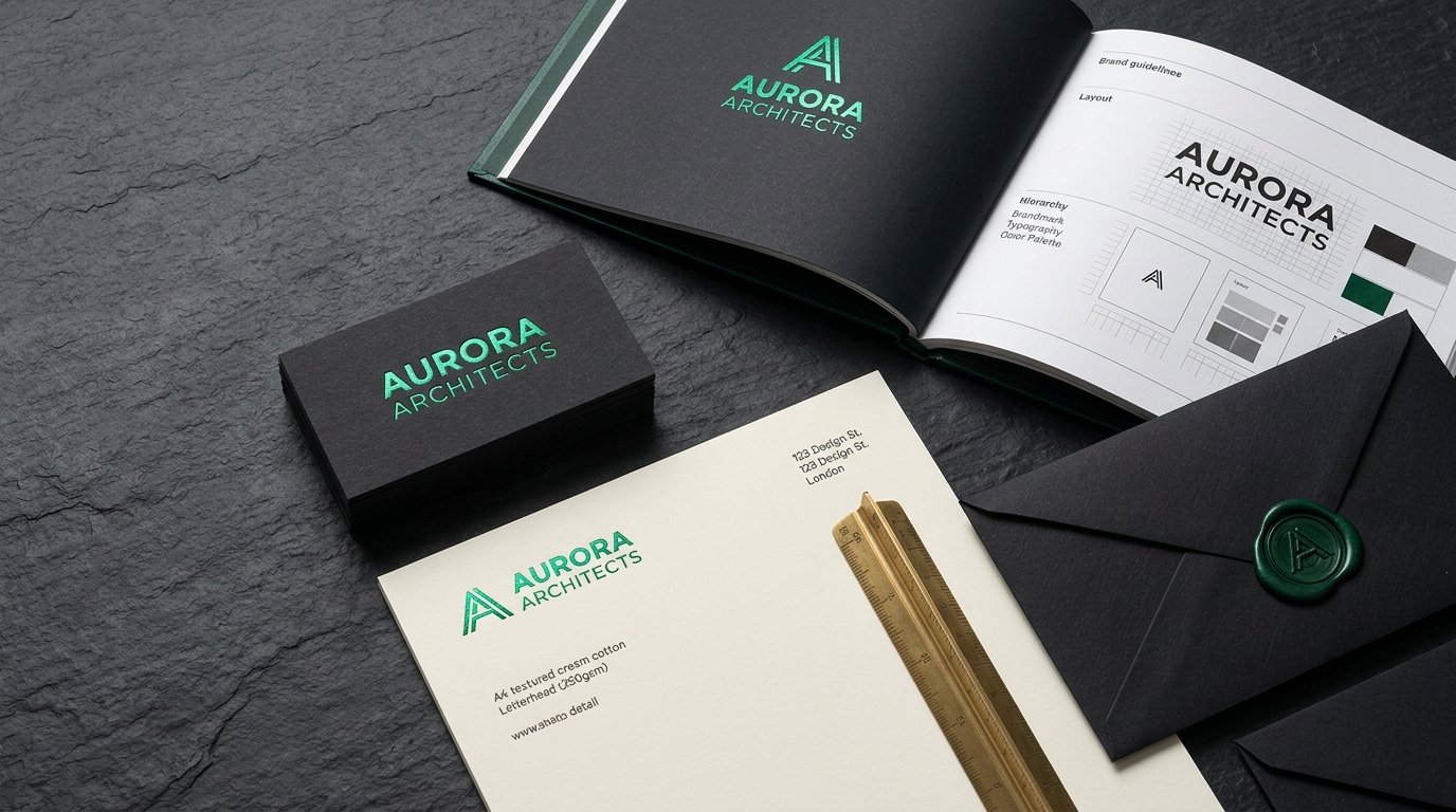
Logomark, stationery, 64-page brand manual

Duration

14 weeks

Case Branding Aurora

The mark is an A drawn from a roof pitch: two strokes, one apex, nothing added.

The brief

Aurora had grown from three partners to forty staff without a consistent identity. Their competition boards, proposals and site hoardings all looked different, and the name was doing none of the work.

The work

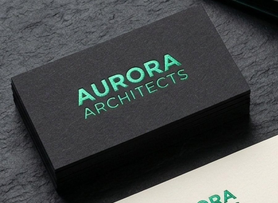
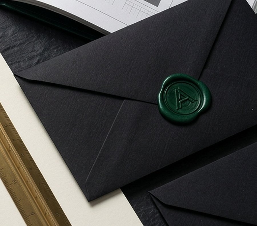
We started from the practice’s own drawings. The A takes its angle from the 35° pitch that appears across their residential work, and the wordmark is spaced to the same module. Stationery is printed in emerald foil on black duplex board, with a bottle-green wax seal for competition entries.
Detail Aurora Card

Business card, emerald foil on 700gsm black duplex board

Detail Aurora Seal

Competition envelope with bottle-green wax seal

The result

The system now runs across proposals, site hoardings and the website. The manual covers the mark, the grid, and three paper stocks, so the in-house team can produce boards without calling us.
64
Page brand manual
35°
Pitch of the A
3
Paper stocks

Have a project
like this?